Personal Visual Identity — Process & System
Solution: Personal Visual Identity
Category: Visual Identity, System Design
Area: Visual Communication & Digital Products
Project: Personal Visual Identity
Tools & Methods: System Design, Custom Typography, Geometry, Figma
About the Project
This project documents the process behind the creation of my personal visual identity, developed as a structured visual system designed to represent clarity, consistency and adaptability across different professional contexts.
The identity originated from the nickname “Zen”, used throughout my personal and professional journey. During the creative process, after multiple sketches and formal explorations, I chose to develop a custom typographic approach as the foundation of the visual system.
Challenge
The main challenge was to create an identity that was not only aesthetic, but functional and scalable, capable of representing my transition toward technology and digital products. The identity needed to communicate balance, logic and structure, while maintaining a clear sense of personality.
Another key challenge was designing a symbol that was simple, recognizable and technically consistent, allowing flexible application across different media and formats.
Solution
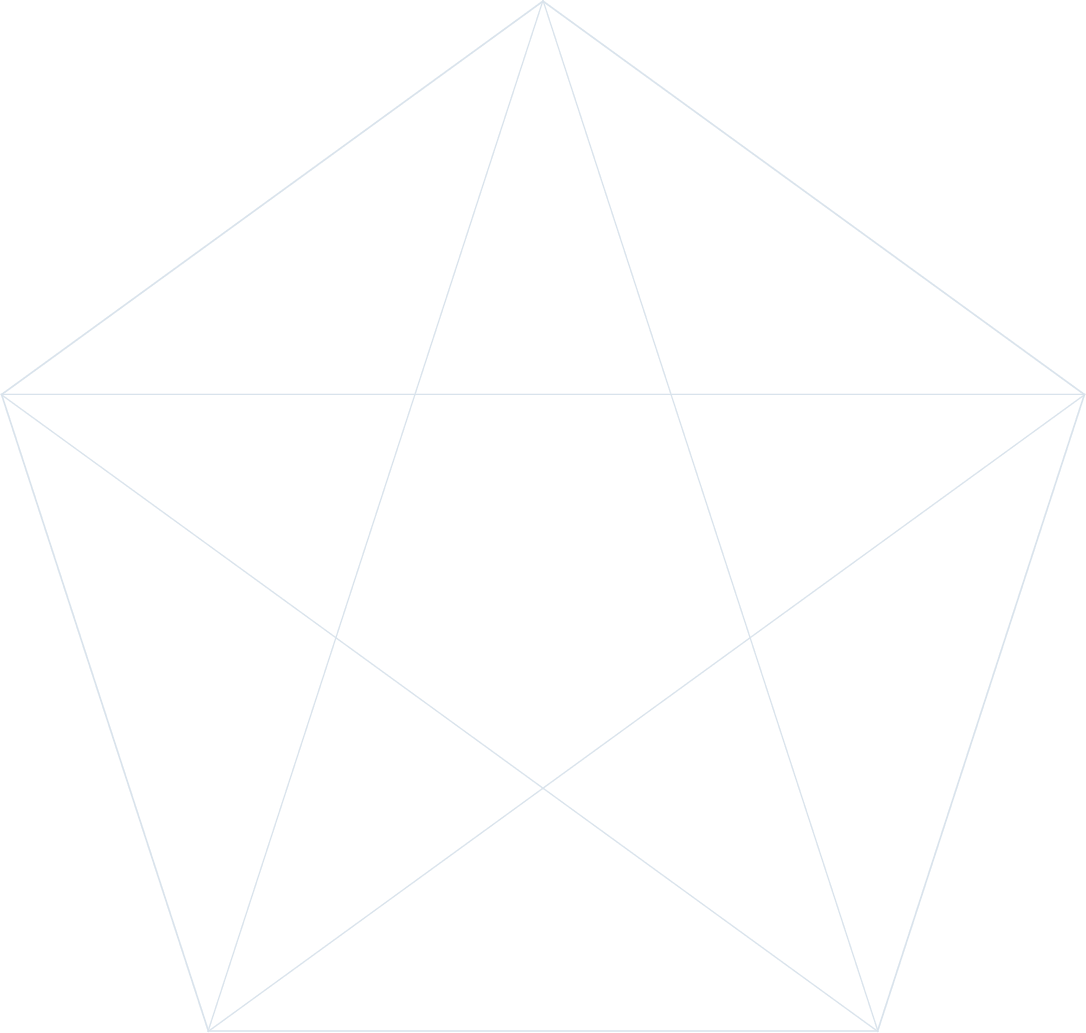
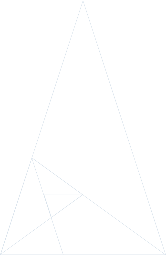
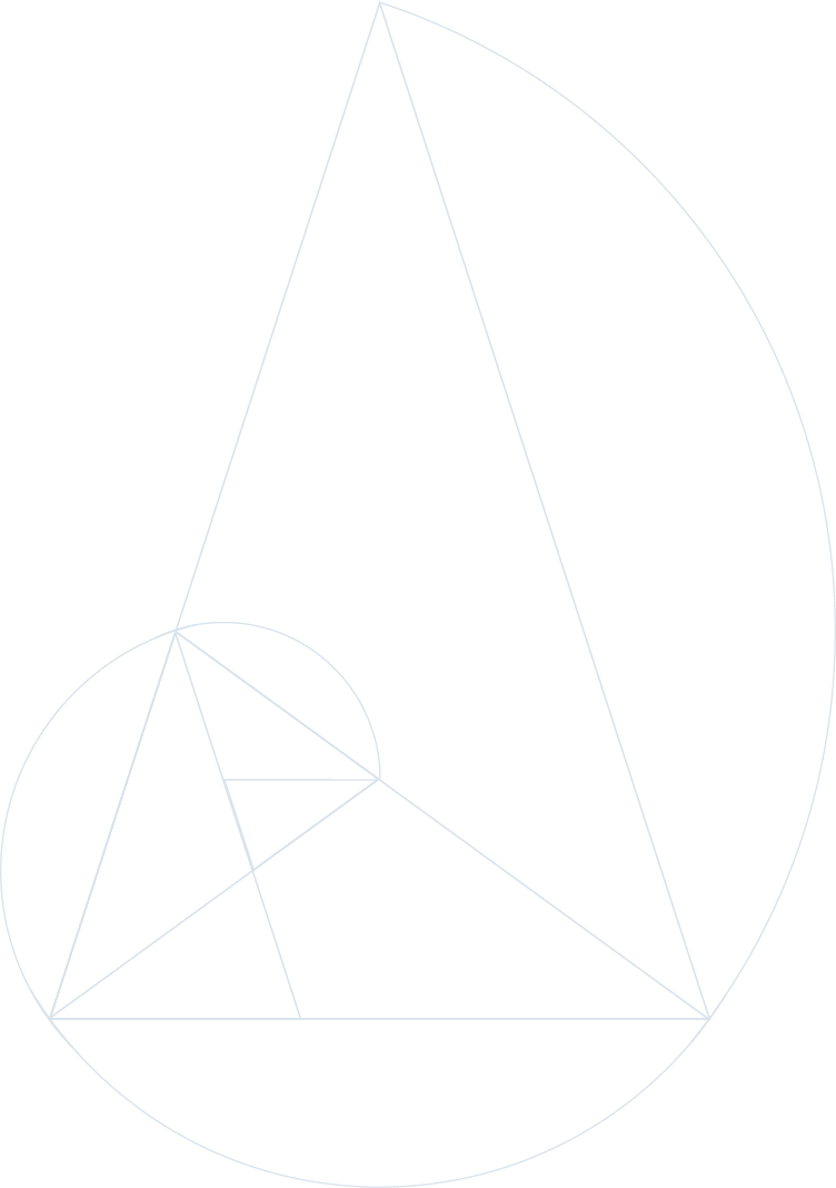
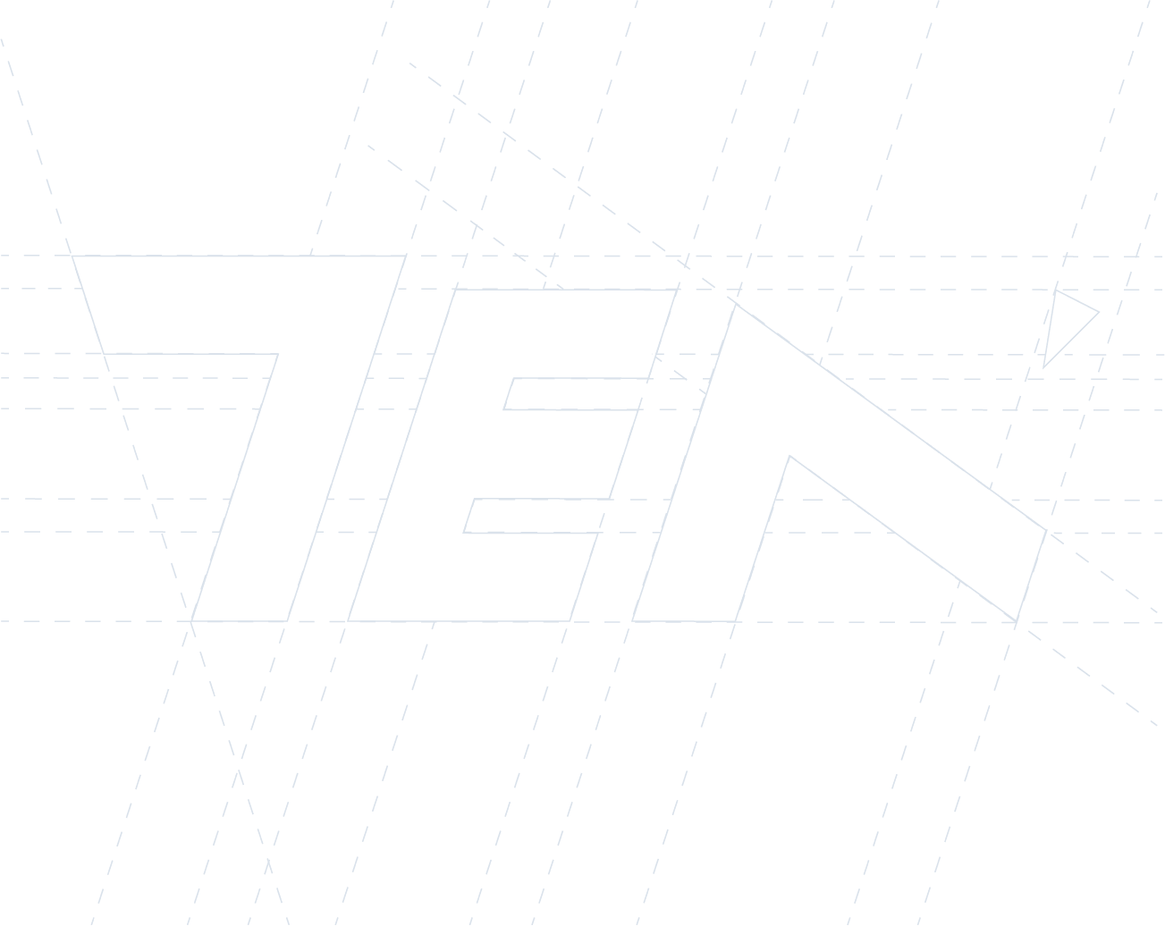
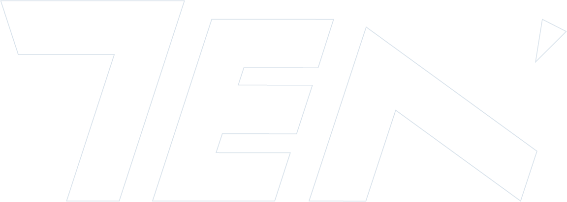
The solution was the creation of a typographic system built on geometric principles, using the golden triangle as the structural foundation. Throughout the process, the form initially conceived as the letter “Z” gradually revealed itself visually as the number 7, adding a new layer of meaning to the identity.
The number 7 reinforces differentiation and also holds personal significance, as it represents my birth date. This visual discovery was intentionally incorporated into the system, strengthening both identity and narrative.
The color palette was defined with a focus on a technological and sophisticated aesthetic, balancing neutrality and personality. Bebas was chosen as the primary typeface, paired with Montserrat as the secondary font, ensuring readability, contrast and flexibility in digital applications.

Result
The result is a visual identity structured as a system, capable of adapting across multiple contexts — portfolio, projects, digital platforms and professional materials. More than a visual mark, the identity functions as a consistent foundation for communication, reinforcing clarity, organization and process-oriented thinking.
This project reinforced my understanding of visual identity as a strategic tool, built through logic, experimentation and intentional decision-making.
The number 7 reinforces differentiation and also holds personal significance, as it represents my birth date. This visual discovery was intentionally incorporated into the system, strengthening both identity and narrative.
The color palette was defined with a focus on a technological and sophisticated aesthetic, balancing neutrality and personality. Bebas was chosen as the primary typeface, paired with Montserrat as the secondary font, ensuring readability, contrast and flexibility in digital applications.
Interested in working together?
Let’s connect on LinkedIn.