SJIT Transport is a freight transportation company with over four years of experience. Its mission is to provide high-quality transportation services with a strong focus on safety, punctuality and operational efficiency. Operating nationwide across Brazil, SJIT aims to be a reliable logistics partner for its clients.
Challenge
The challenge was to develop a logo that incorporated essential characteristics such as simplicity, easy recognition, strong visibility at small sizes and a modern visual appearance, while clearly representing the company’s values within the logistics sector.
Solution
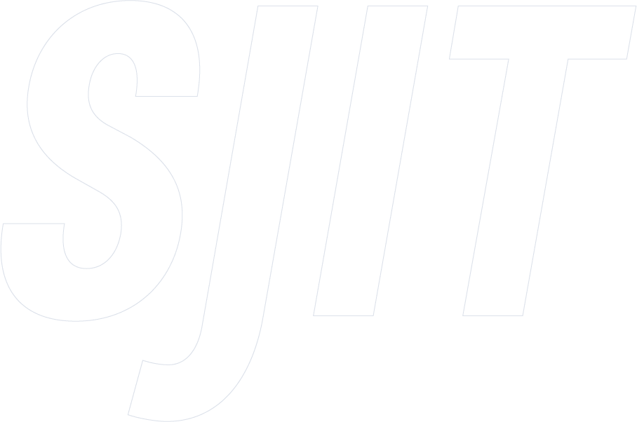
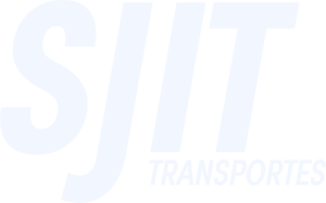
For the SJIT Transport logo, a typographic identity was developed, using the company name as the core visual element in a clear and straightforward way. The chosen typeface was Sofia Pro Condensed Bold Italic, selected for its modern look and sense of reliability — qualities aligned with the company’s positioning.
Additionally, kerning adjustments were applied to ensure optimal readability and visual balance, even at reduced sizes. The slogan “Driving Wisdom and Trust Along the Path of Efficiency” reinforces the company’s values, including safety, trust and punctuality.
Result
The new SJIT Transport logo, with its clean and modern typographic design, proved effective in strengthening the brand’s visual identity. The custom typography combined with precise kerning adjustments ensured strong legibility and a balanced appearance, allowing the brand to stand out across both printed and digital materials.